AUDREY JACOBS


&
Recent Work ◑ Future Tech ◑ Mobile ◑ Process ◑ Contact
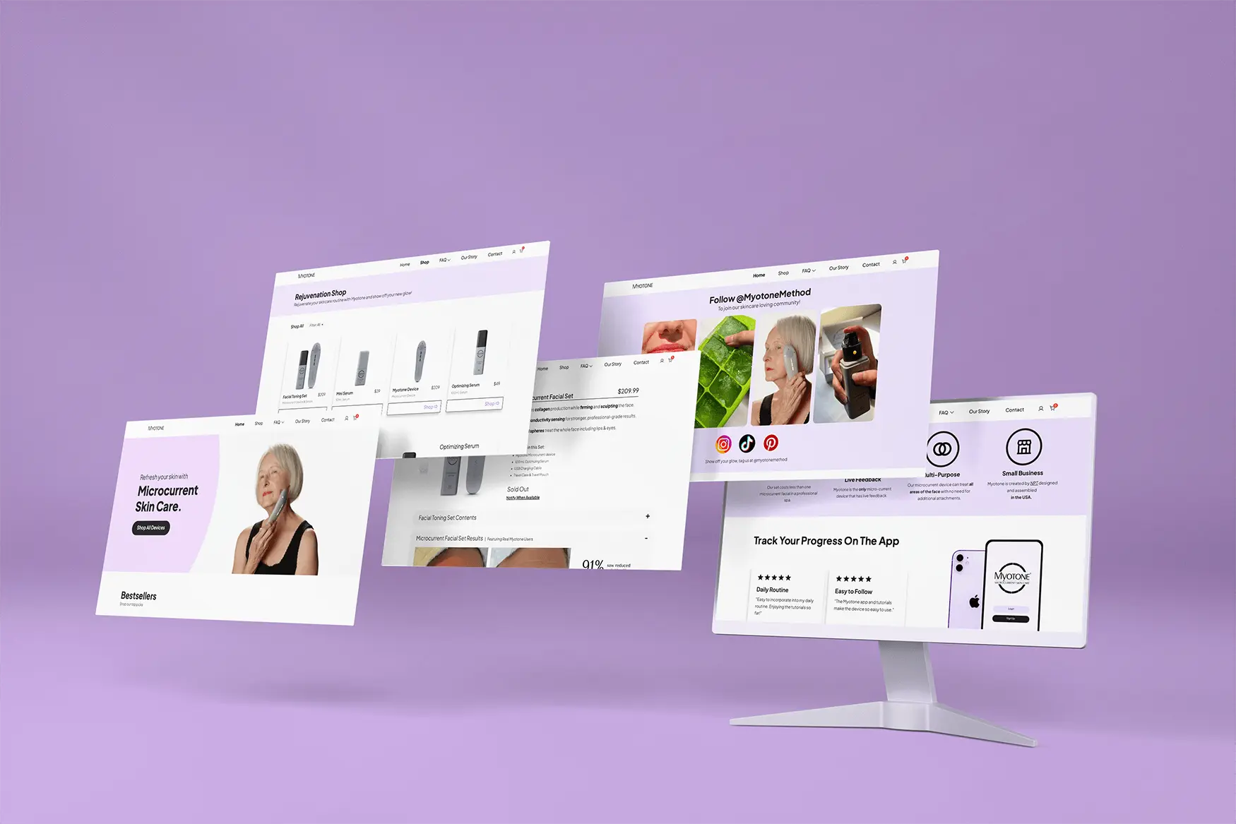
Designed and developed this wordpress e-commerce website, using a child theme to customize the page with my own CSS & HTML. Integrated Woo-commerce and Stripe plugins.
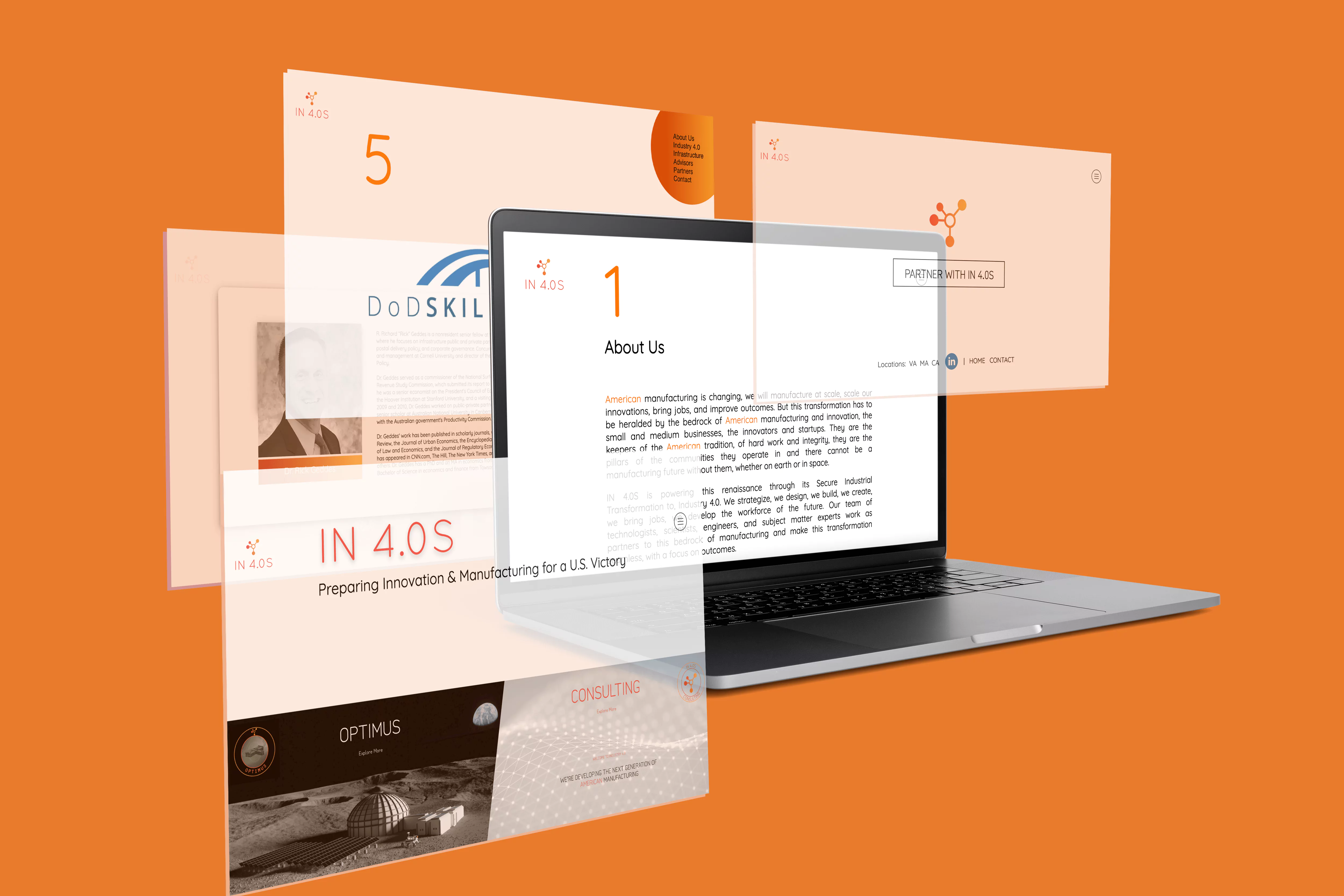
Conceptualized a full redesign of the IN4.0S company’s website as part of a UX team. Led development of the site through to deployment and multiple site updates.
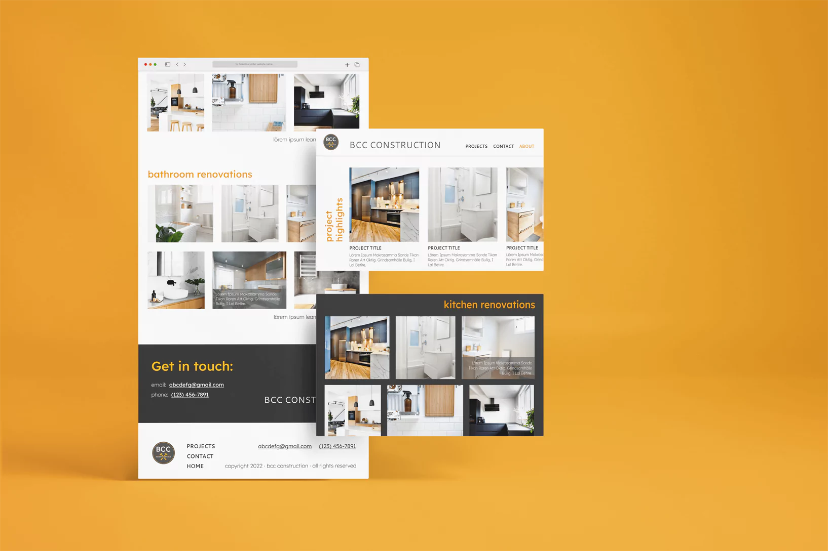
Created a fully functional Figma prototype for this construction company’s portfolio of work. Cleanly & efficiently showcases the client’s skillset.
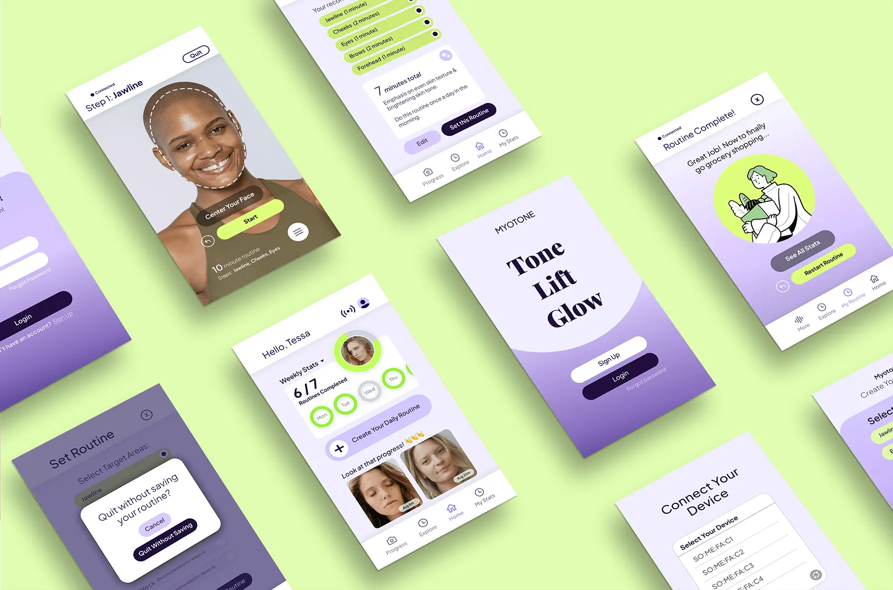
Prototyped a complex app with bluetooth device connectivity feautures, and streamlined the user experience for maximum joy. Fully functional Figma prototype using components & variants.
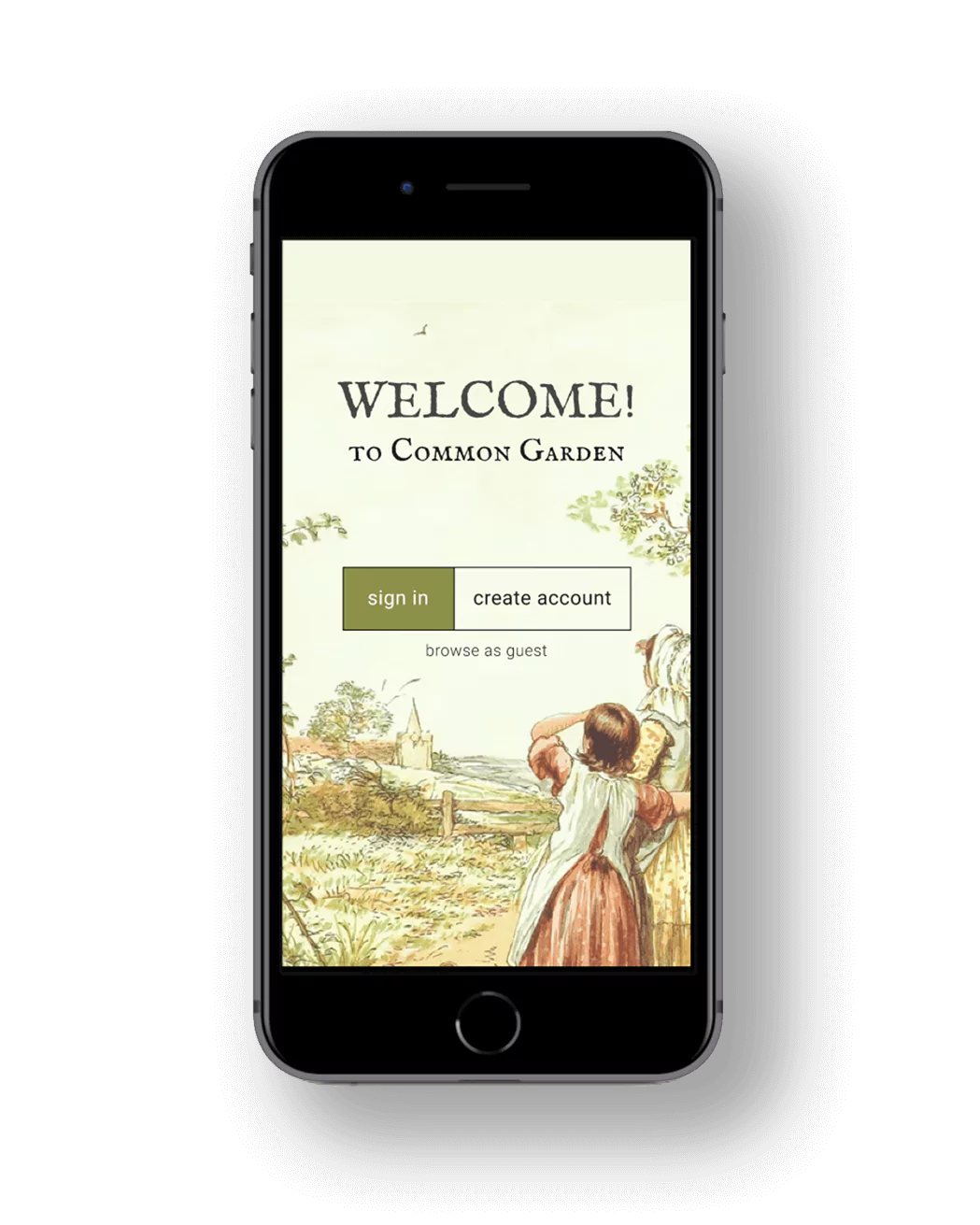
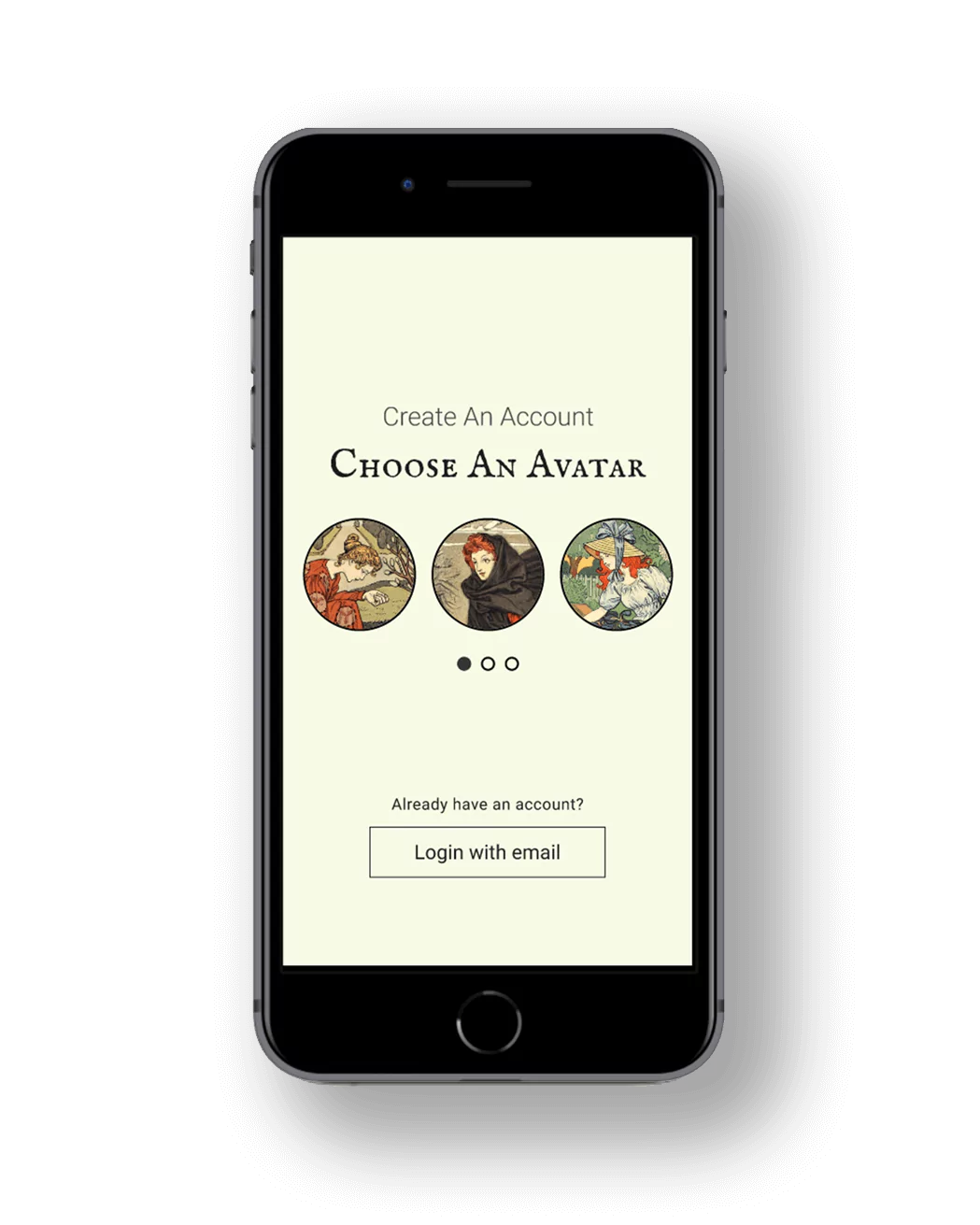
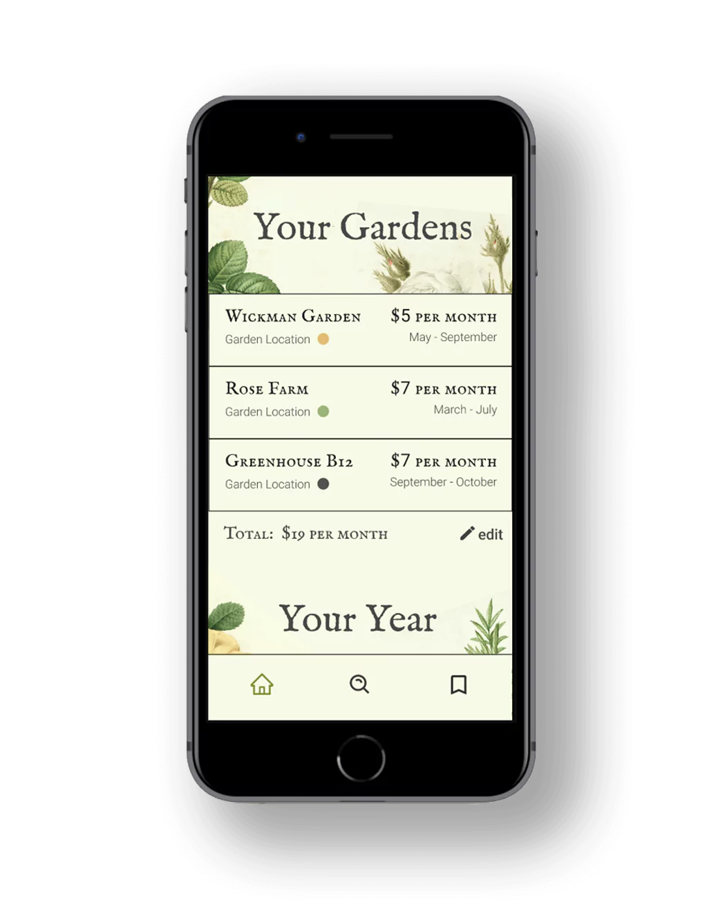
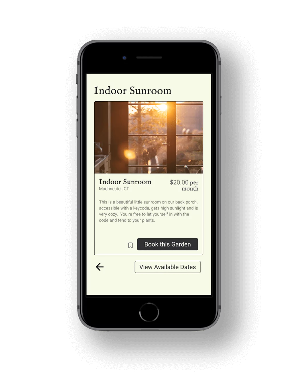
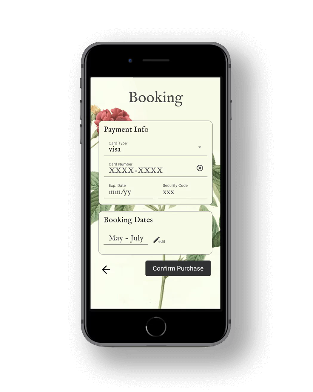
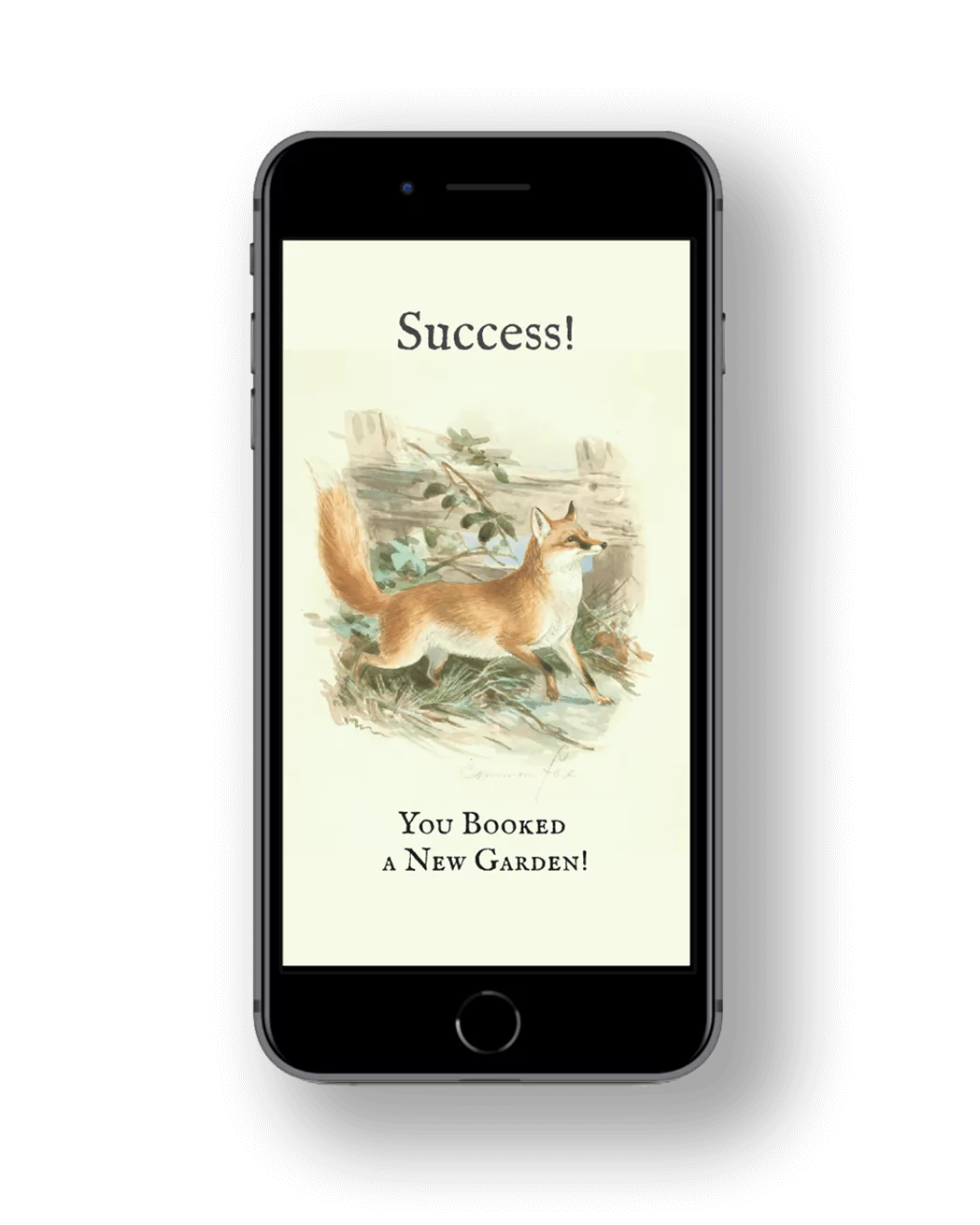
The style of this app was inspired by vintage seed packets & 1950’s movie tickets. I captured this style with similar fonts, borders, and real vintage drawings. The booking process is streamlined to be clean, whimsical and enjoyable for the user. This app was created within the guidelines of Google Material 3 Design.
VIEW CASE STUDY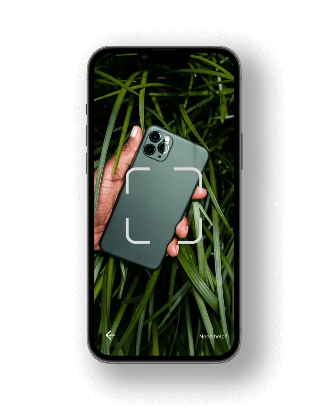
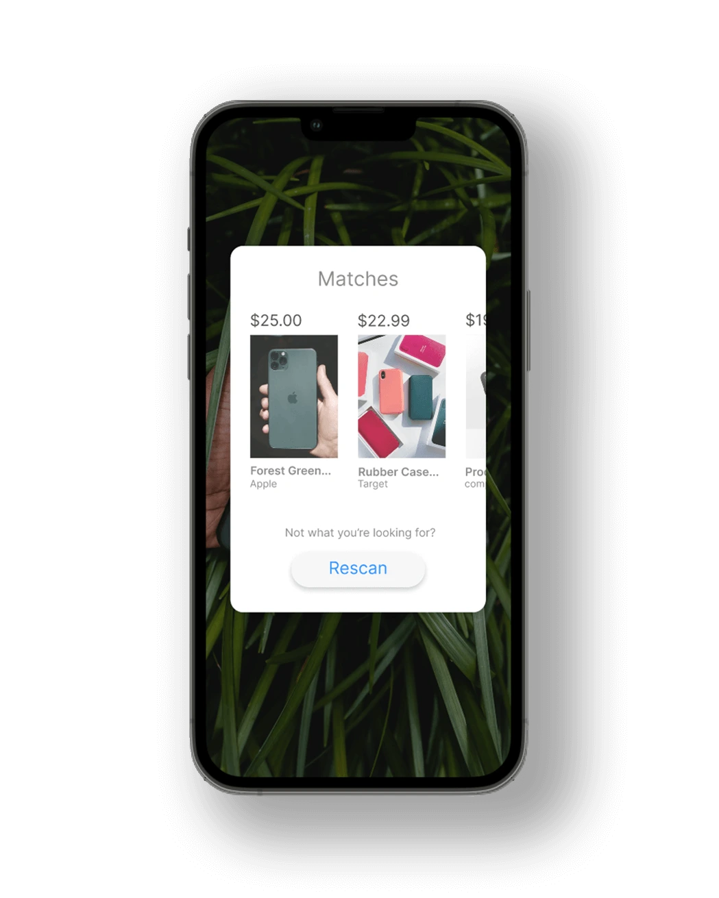
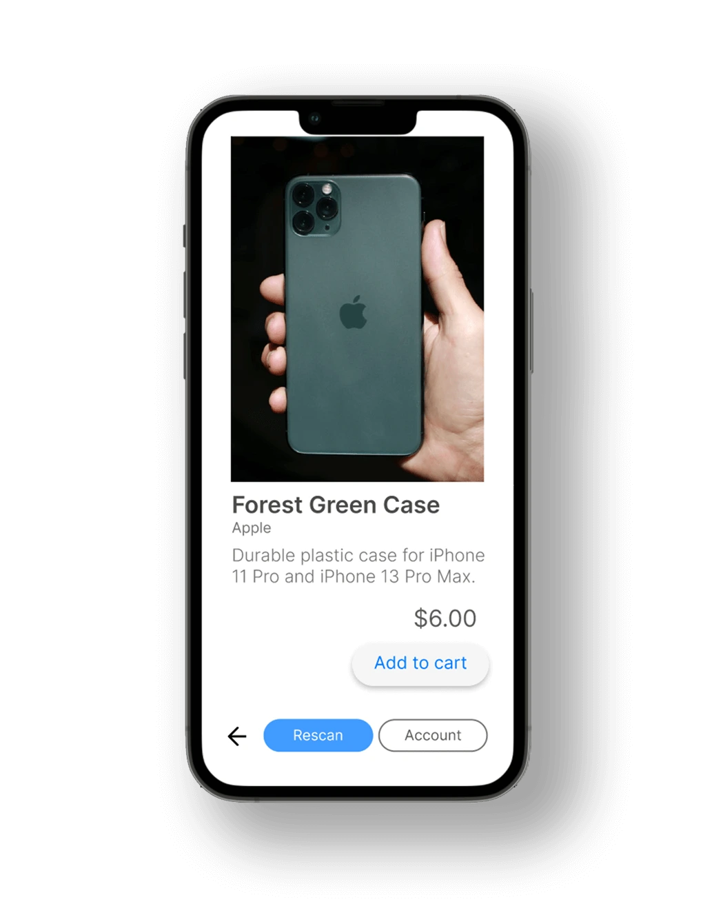

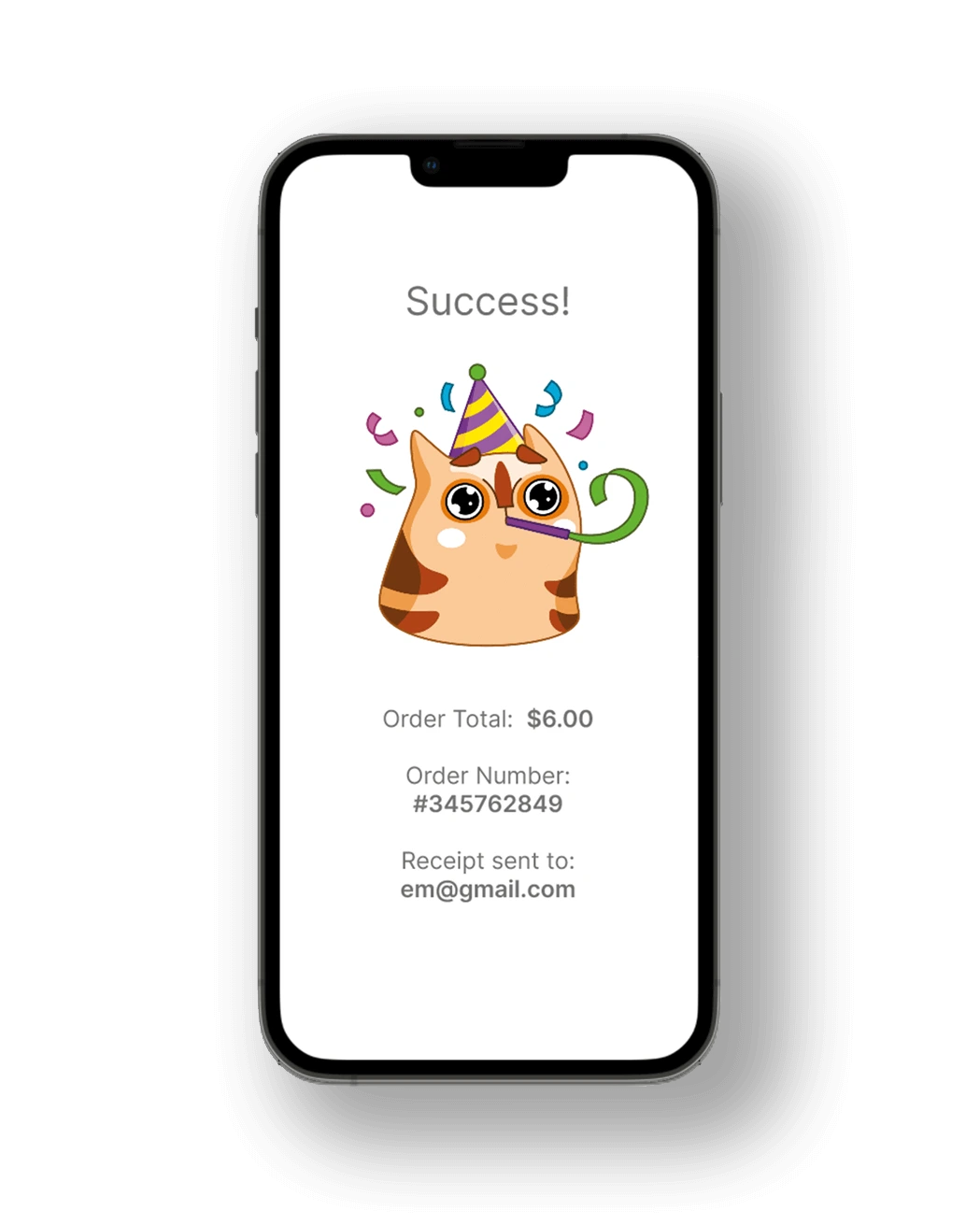
This one tap checkout experience was designed to work with AR technology which scans a product using the device’s camera, then finds similar products online. The user experience is designed to use the least clicks possible to streamline the user through the purchase seamlessly.
VIEW PROTOTYPE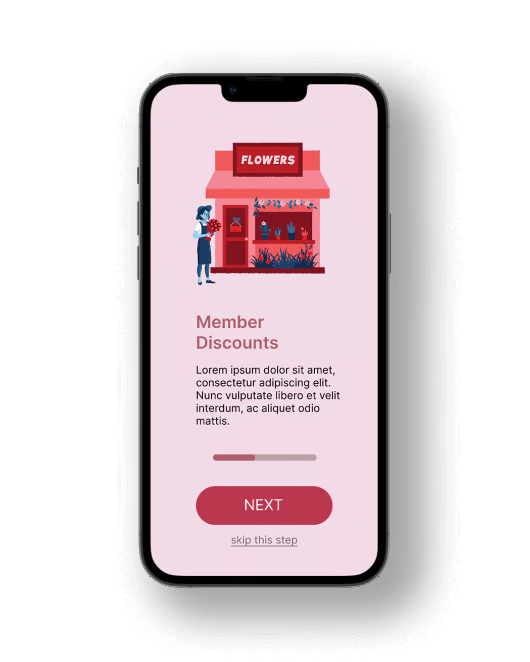
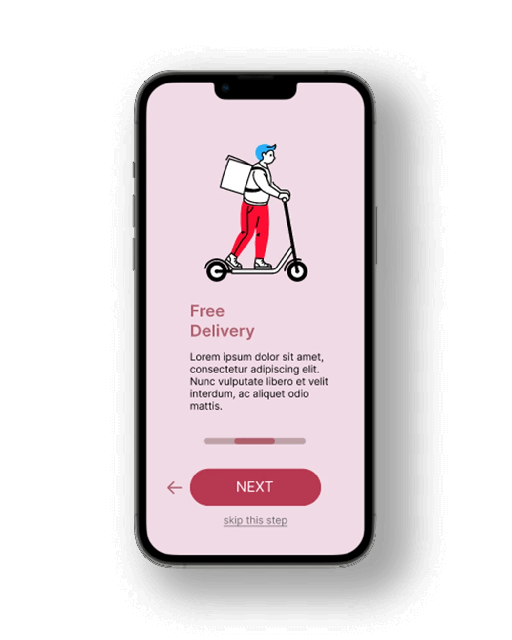
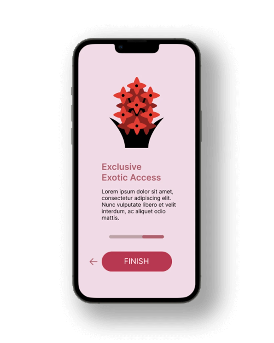
These app onboarding screens are a simple, colorful, & inviting first experience with the app. As onboarding can be annoying for the user, there is an emphasis on wayfinding to show there are only three steps, adding interest with cute images, and making each step easily skippable.
VIEW PROTOTYPEUnderstanding
Research
Wireframing
Prototyping
User Testing
Development
Testing
Deployment

Audrey Jacobs | BS in Web Design and Development
LinkedIN