AUDREY JACOBS
| RECENT PROJECTS


PROCESS
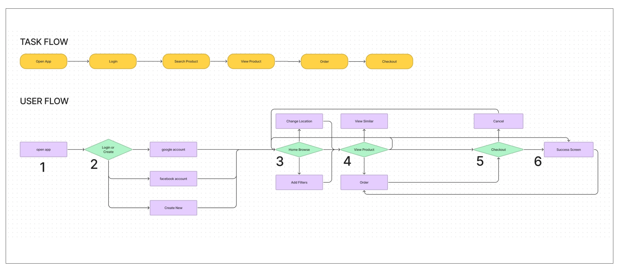
These flows show the order of tasks the user generally would follow to reach their end goal. Using this information I designed the app experience around their needs, anticipating their next steps for them.
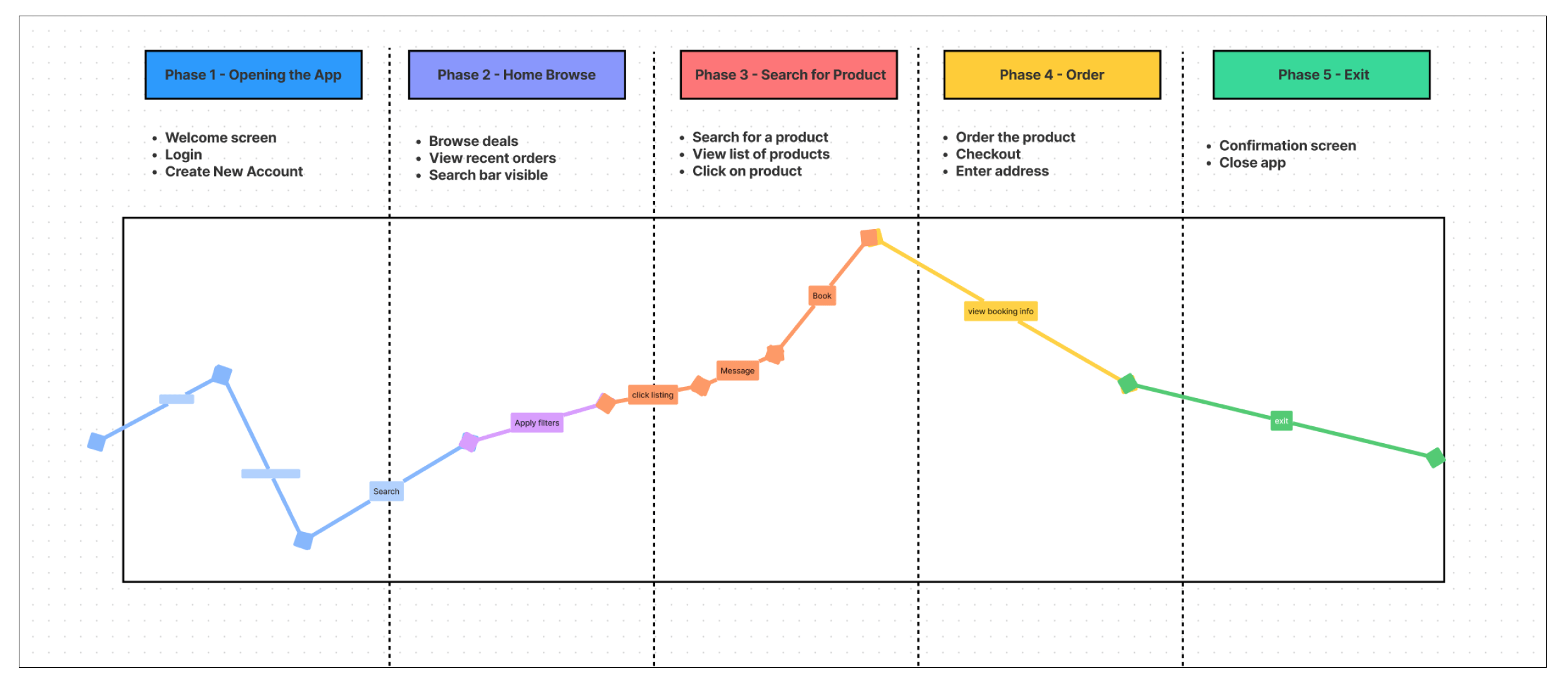
This journey map helps visualize the anticipated highs and lows of the app experience. Identifying lows helps me focus on what areas need to be smoother & less taxing on the user.
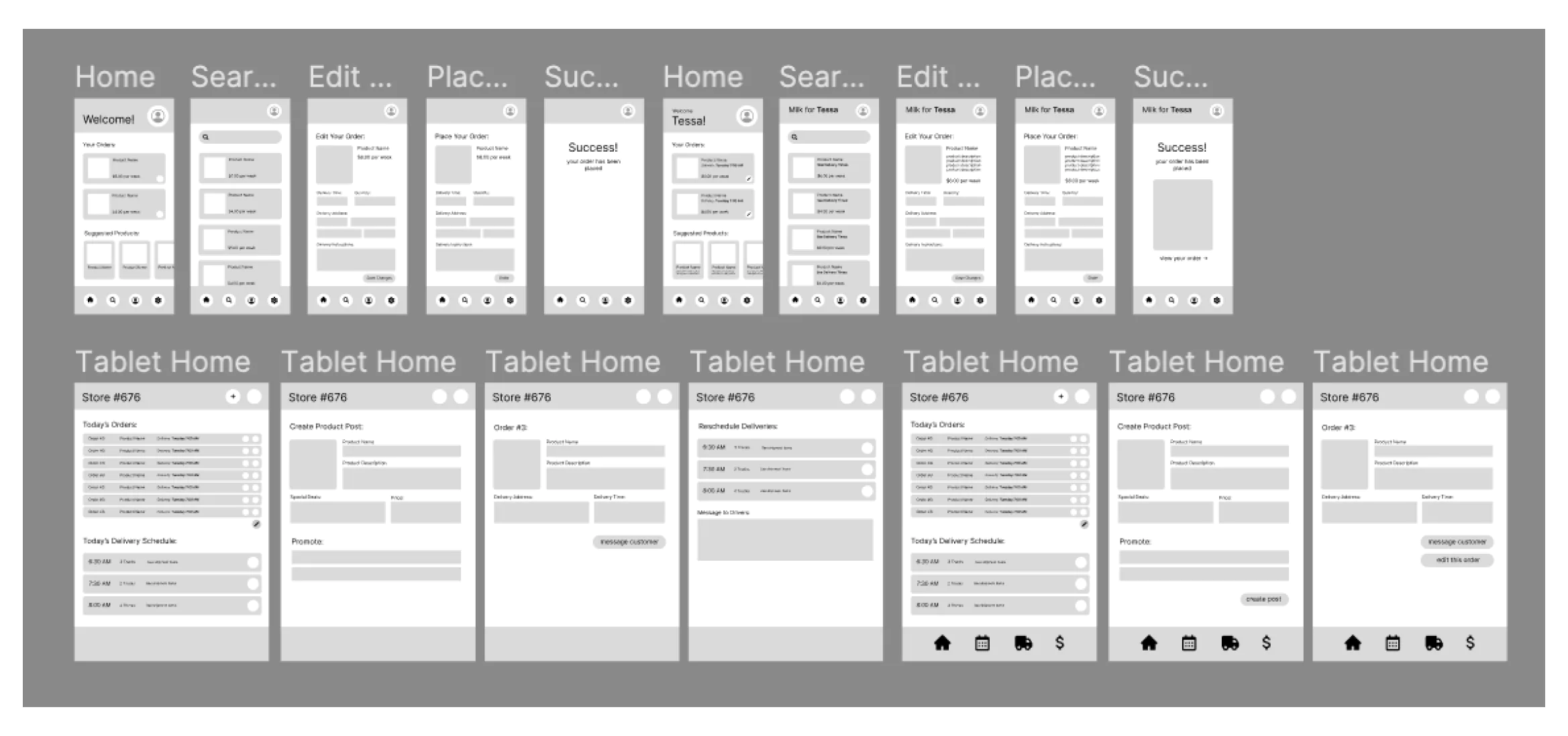
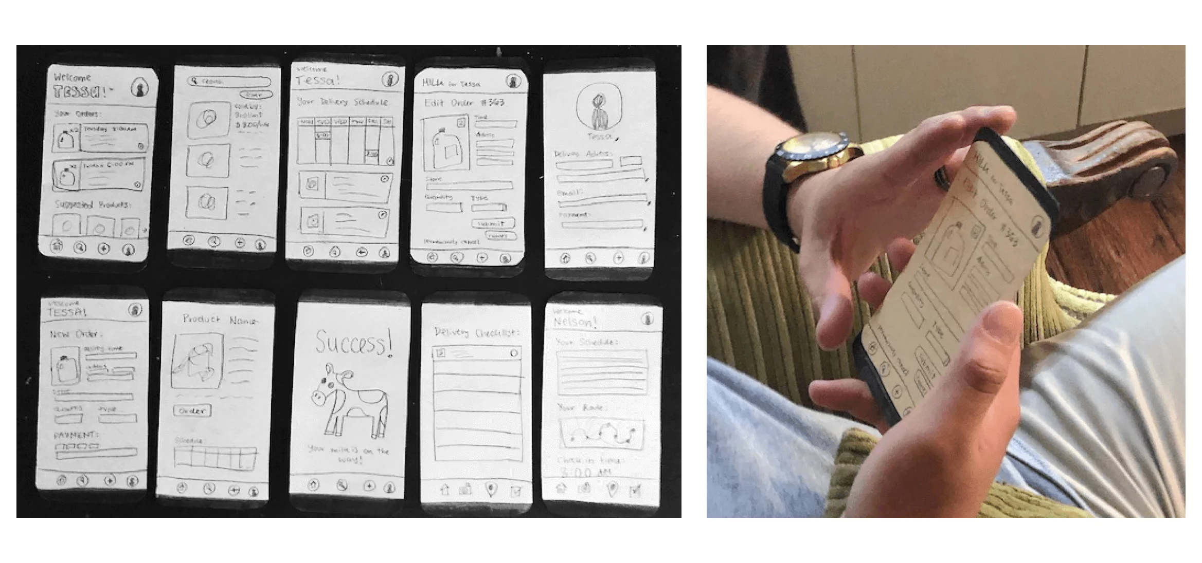
Using the tasks identified by the user flows to dictate the necessary screens, I created simple black and white wireframes to begin outlining the design of the app, on both phone and tablet.
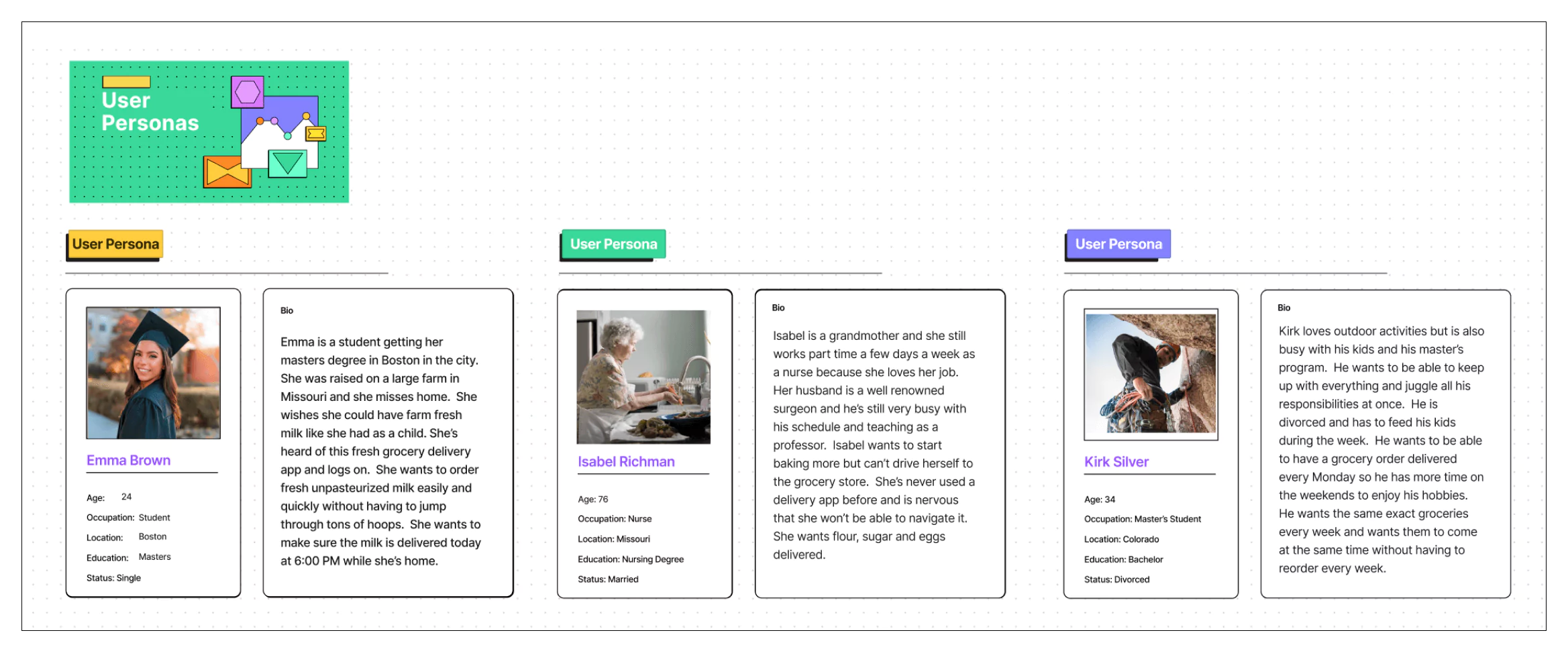
Specific user personas were created in order to enter the mindset of the user before user testing. Each persona has goals, fears, and a specific objective.
Volunteers were assigned a user persona and specific task. They were observed as they navigated a paper version of the app wireframe. Notes from these user tests were used to refine the design.
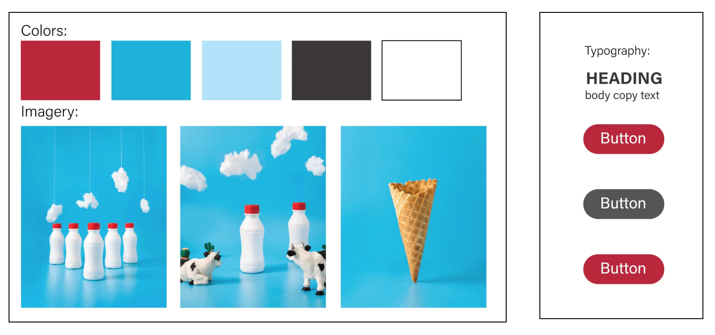
A style guide was created to ensure cohesive colors, fonts and sizing throughout the app, regardless of screen size.
The final app design was produced as an interactive figma prototype adjusted to be responsive for both phone screens and tablets.
PSD MOCKUPS: Image by zlatko_plamenov on Freepik | Image by rawpixel.com on Freepik | Image by rawpixel.com on Freepik | Image by Freepik | Image by designwarrior on Freepik | Device Icons from https://icons8.com | https://icons8.com/illustrations/illustration/609a2cf5bfaf070001af4ff6

Thanks for Visiting!